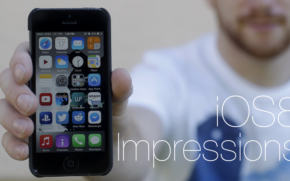
Disclaimer: This was tested using a 64 gigabyte iPhone 5.
iOS7 was a drastic step up from iOS6. Apple finally hit their stride by streamlining what they had, borrowing from Android, and making it look a whole hell of a lot slicker. It has been a year since iOS7 was pushed on us and I still have not grown weary of its look or functionality.

With that praise comes almost a preemptive strike against iOS8, the newest iteration on Apple’s operating system for (most of its) phones and tablets. iOS8 offers a few new features – ones that improve the experience – but it is not anything radically different or any sort of game changer.
My most anticipated feature was the way in which you could respond to notifications. Switching apps to answer a text was not the most convenient way to get things done. Now you can respond directly through the notification bar, which eliminates a step and works pretty well. Sometimes the small buttons are easy to accidentally press, but it is a tiny nitpick nestled within a great addition.
The actual keyboard that you type with has a “new” suggestion box, one that Android has had for ages. It can be useful at times, but you can push it down if you feel like it is cramping your style… or the literal space on your keyboard. This feature was seemingly made for the iPhone 6 and iPhone 6 Plus since it takes up a bit of space that the iPhone 5 was not really designed for. Because of this, it is easy to accidentally keep pressing in different phrases when you mean to send your message. Luckily, it can be pulled down to give more room to the rest of the keyboard, which is something I feel most iPhone veterans will do. Most of the time anyway; some apps have yet to adopt some of these new features (like Facebook Messenger).
Other than that, iOS8 is just sort of… there. Neat additions like seeing which apps drain the most battery, double-tapping the home button to see recent contacts, and exiting a group text are welcome, incremental improvements, but nothing really matches what Apple has done in the past. That is mostly a backhanded compliment since it took them so long to finally catch up with competition. But now they are at the finish line with nothing to really rally around, except their new lame fitness app.
But it is a free update, one that does not impede current users nor does it make the entire experience worse. iOS has finally reached a point where most of the big issues have been addressed which allows them to rest on their laurels as much as it should encourage them to step up and really innovate. But for now, we should just complain about our free U2 album, because that is the real tragedy here.


![Hashem Mishal using an angle grinder to cut a drill bit, in the SAE team’s garage at SF State on Tuesday, Nov. 12, 2024. “We don't get anything from the school other than this workshop,” Mishal said. “Our advisor, he runs the shop, and he also works with us to try and get as [many] opportunities as possible. So it was really nice, in helping us get this space, but all the tools are just some of the guys’ or third parties’. I don't know where these tools came from, but a lot of it was sponsors, donations from alumni. Right now, all the hardware we’ve been paying out of pocket for the time being.” (Jonah Chambliss / Xpress Magazine)](https://xpressmagazine.org/wp-content/uploads/2024/12/Chambliss_F1_001_LEDEPHOTO-1200x800.jpg)


